Your employment portal IS your front door. Treat it that way.
Or: UX Design Tip: Don’t ask for things you don’t actually need
I was recently filling out an online job application for a senior level job. It continues to amaze me how many companies treat their applicant portals more like the back alley entrance to the firm rather than the front door. They should really have similar quality work on the User Experience that they would put into their web presence.
To be fair, many of these have really gotten focused and good where they:

- Share clear information about the company and work environment
- Ask for basic demographic and contact information. Once.
- Provide the ability to link to a social profile where lots of other information already exists online about the applicant like LinkedIn (perfect choice), Facebook or Twitter (questionable but reasonable choices)
- Provide the ability to upload or otherwise enter a resume or other narrative document
- Ask only the necessary questions for their process (EEOC data or eligibility information for example)
Done. That’s it. Off it goes to a human or more likely a database with all information needed for an initial screen.
But, then there are the others which sadly are still far too prevalent:
- First there are the clearly legacy systems that walk you through page after page of badly designed forms to provide the data that is already available in either a resume or online profile. I can almost excuse these due to their legacy nature. Almost. Come on, it’s 2018 now. At least add a parser for the resume to pre-populate the basics.
- The ones which lead you through separate iterations of the same information as the systems hand off from one subsystem to the other. Ugh. I’ve been known to take those as a sign that I don’t want to work there.
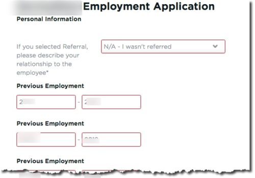
- Unnecessary precision. There is no reason to demand to know the day on which I started and stopped a job 10 years ago. It’s questionable whether the month even matters in most cases. This is just lazy UX work. Somebody ticked the box that that a standard date field is mandatory.
- Then there are the sites that flag information fields as necessary when they simply are not. Or at least not at this point in the relationship where we are just ‘getting to know each other’.
Examples include:
- Previous salary. This is actually illegal in California now but still there
- Undergraduate GPA for an experienced hire. Even Google has learned (from data, no less “G.P.A.’s are worthless as a criteria for hiring, and test scores are worthless. … We found that they don’t predict anything.”) that this is only a mediocre predictor of fresh college hires and totally pointless for experienced hires.
- References on initial application. My favorite. Under no circumstances will I be providing names and contact information for you to harass before we’ve even spoken. Reference checks should be very late in the cycle to validate that I am what you think I am. These people do not need to field calls from every company I ever talk to. Worse yet, it is a privacy violation to no purpose since so many companies never even check references anyway.
Just remember: Hiring portals really are the front door for the people you want to work with. Treat them that way. Give them at least a little bit of the UX and design love you would give your product or website.